
After driving to Silicon Valley for the past 30 years I am acutely aware of traffic patterns and to me that directly relates to the economy. The recession of 2009 really hit traffic patterns with what I would estimate as a 20% unemployment rate in Silicon Valley. I could leave my home in Danville anytime of the day and have no traffic problems. That is certainly no longer the case and I blame the mobile electronics boom, absolutely.
One of the websites I frequently visit, second only to SemiWiki, is Business Insider. Henry Blodget has a staff of researchers and puts out the most interesting content on the internet today, lots of interesting graphs too.
In the back of my mind I wonder: “Where does all the money my family is spending go?” Mobile electronics and the monthly service plans, home electronics and the monthly service plans. Everywhere I look money is being spent, profits are being made, so why are so many American families still struggling financially?
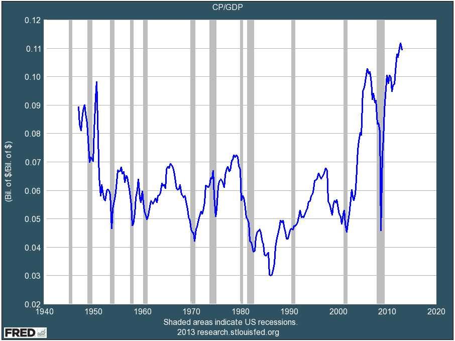
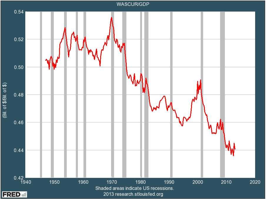
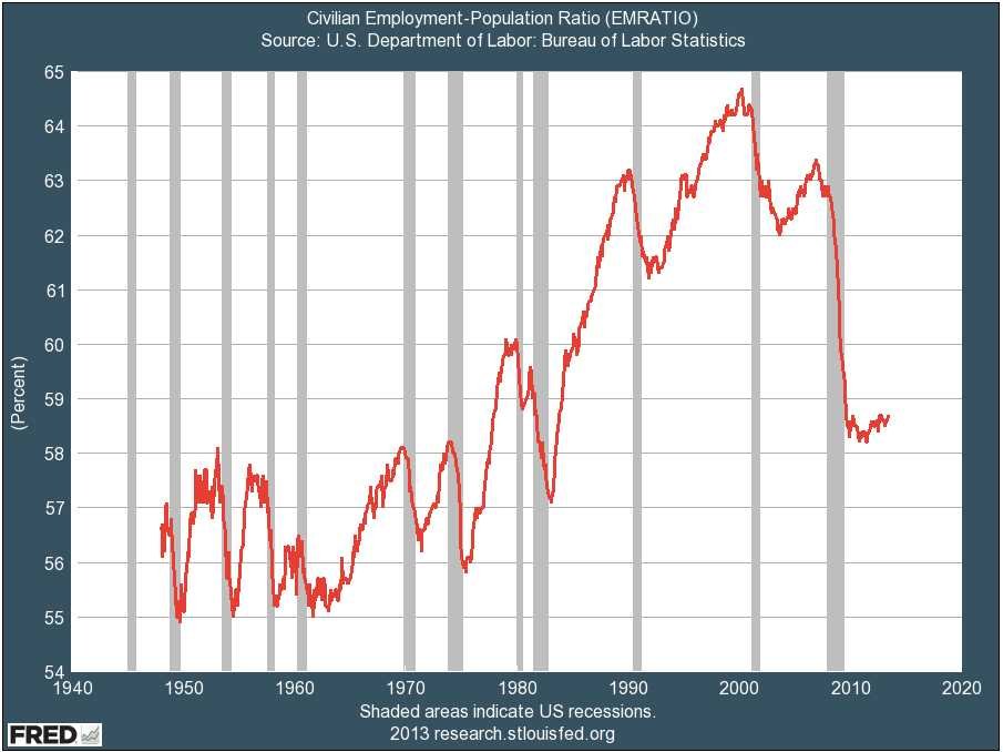
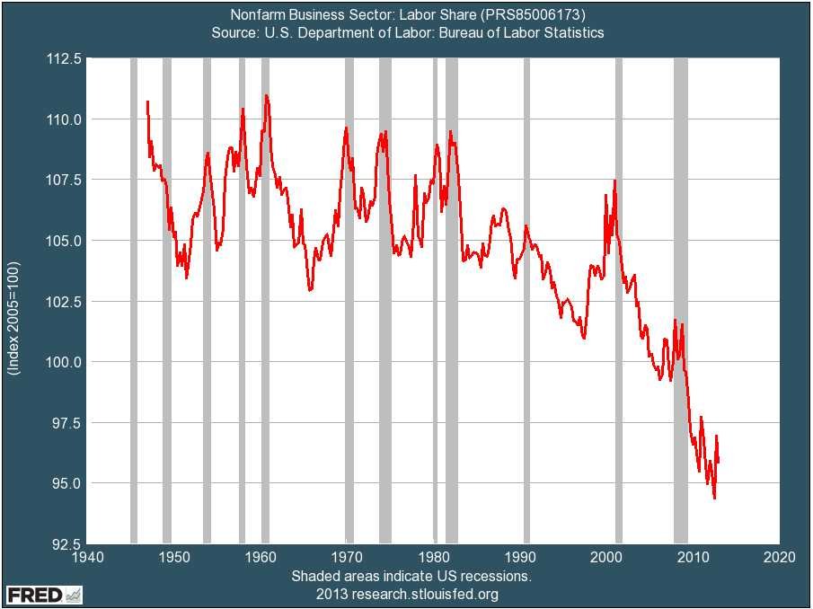
According to Henry Blodget Corporate Greed is the culprit and given these graphs I agree 100%:
Corporate profits and margins are spiking:
Wages as a percentage of the economy are at an all time low:
Employment rates fell off a cliff in 2009 and still have not recovered :
The majority of the national income is going to the executive ranks:
As I mentioned before, I think the stock market is a racket where insiders profit at the expense of the masses. Publicly traded companies are at the mercy of Wall Street so by my definition they are part of the racket. One of the reasons why I favor GlobalFoundries is that they are privately held and can make decisions based on the greater good of the fabless semiconductor ecosystem versus the short term gains Wall Street favors. Just my opinion of course.
Wall Street the Movie, Gordon Gekko:
The richest one percent of this country owns half our country’s wealth, five trillion dollars. One third of that comes from hard work, two thirds comes from inheritance, interest on interest accumulating to widows and idiot sons and what I do, stock and real estate speculation. It’s bullshit. You got ninety percent of the American public out there with little or no net worth. I create nothing. I own. We make the rules, pal. The news, war, peace, famine, upheaval, the price per paper clip. We pick that rabbit out of the hat while everybody sits out there wondering how the hell we did it. Now you’re not naive enough to think we’re living in a democracy, are you buddy? It’s the free market. And you’re a part of it. You’ve got that killer instinct. Stick around pal, I’ve still got a lot to teach you.


The Packaging PDK Is the Missing Layer for Co-Packaged Optics