

In the mid 1980’s, Tommy George, then President of Motorola’s Semiconductor Sector, pointed out to me that the semiconductor revenue per unit area had been a constant throughout the history of the industry including the period when germanium transistors made up a large share of semiconductor revenue. I began tracking the numbers at that time and continue to do so today. So far, it’s still approximately true. If you are making a decision about a capital investment in semiconductor manufacturing, or even an investment decision for the development of a new device, this is a remarkably useful parameter to test the wisdom of your investment. Figure 1 shows revenue per unit area data for the last twenty-five years (since I didn’t keep my records before that time). There are many possible explanations for why this empirical observation should be approximately correct. One of those explanations is the fact that semiconductor revenue and semiconductor manufacturing equipment costs, materials, chemicals and even EDA software costs all follow learning curves based upon the number of transistors cumulatively produced through history. Semiconductor revenue follows a learning curve that is parallel to the learning curves for all input costs to the design and production of semiconductors and is decreasing on a per transistor basis by more than 30% per year (FIGURES 2 through 6). The cost per transistor and the cost to process a fixed area of silicon therefore decrease at a constant rate with the same slope which is also the same decreasing slope as the revenue per transistor. The ratio between revenue and area therefore stays approximately the same.
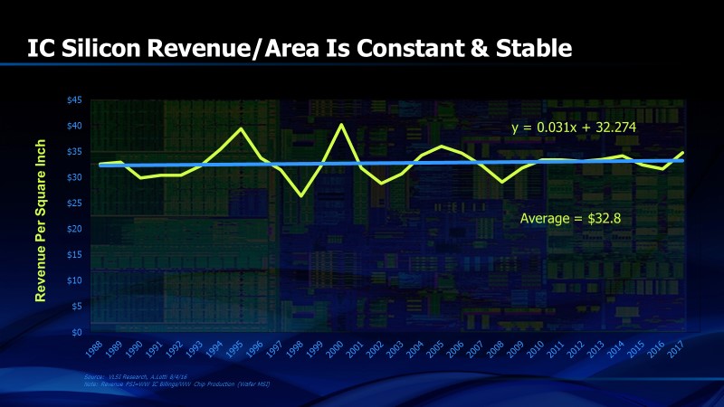
Figure 1. Revenue per unit area of silicon or germanium has been a long term constant of the semiconductor industry
FIGURE 2 provides another observation that most customers of electronic design automation (EDA) software find surprising. I’ve found that most EDA customers think that the EDA industry charges too much for its software and doesn’t feel the same pressure to reduce costs that is felt by its customers, the providers of chips. The learning curve for EDA software refutes this. The number of transistors sold by the semiconductor industry is a published number each year. So is the total revenue of the semiconductor industry and the EDA industry. When the EDA total available market (TAM) is divided by the number of transistors produced, we obtain the EDA software cost per transistor. This then shows that the EDA industry is reducing the cost of its products at the same rate as the semiconductor industry. That is as it must be. If the EDA industry doesn’t keep its learning curve parallel to the semiconductor industry learning curve, then the cost of EDA software as a percent of semiconductor revenue would increase and there would have to be cost reductions elsewhere in the semiconductor supply chain to offset it. As it is, EDA software costs are about 2% of worldwide semiconductor revenue (FIGURE 7) and this percentage has been relatively constant for the last twenty-five years. This is also a fixed percentage of worldwide semiconductor research and development (FIGURE 8) which has been a relatively constant 14% for more than thirty years.
![]()
FIGURE 2. Learning curve for transistors and EDA software
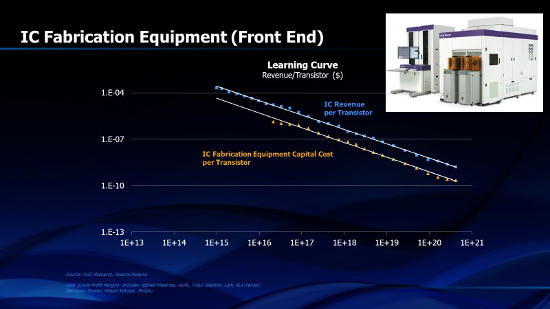
FIGURE 3. Learning curve for front end fabrication equipment
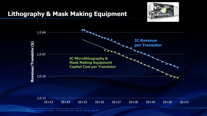
FIGURE 4. Learning curve for lithography and photomask making equipment
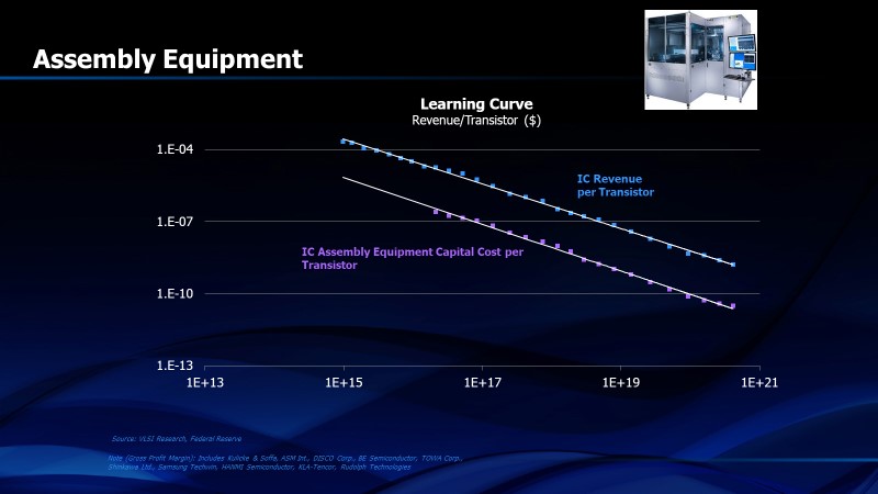
FIGURE 5. Learning curve for semiconductor assembly equipment
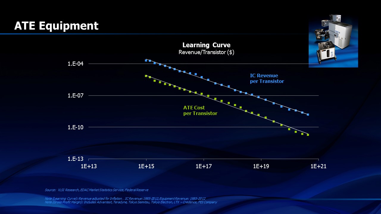
FIGURE 6. Learning curve for semiconductor automated test equipment
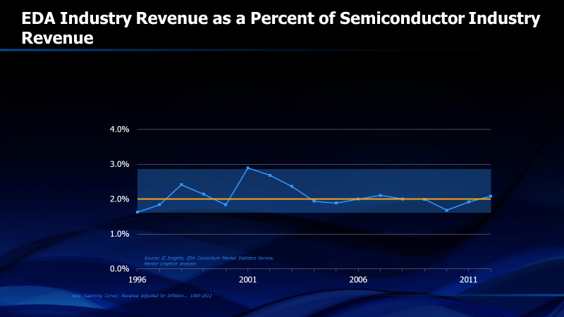
FIGURE 7. EDA revenue as a percent of semiconductor revenue
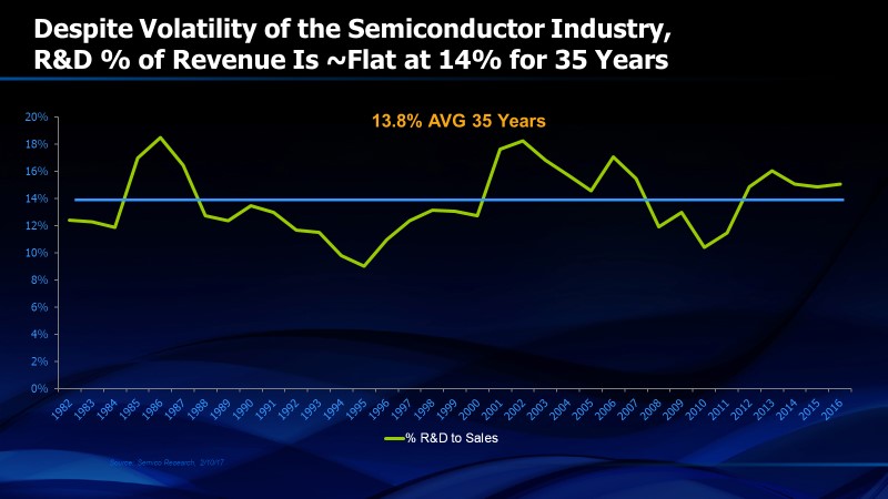
FIGURE 8. Semiconductor Research and Development as a percent of semiconductor industry revenue
Figure 9 shows the annual production of silicon measured by area. This measurement follows a long term predictable curve. Actual data moves above and below the trend line as companies over-invest in capacity when demand is strong and under-invest in periods of market weakness. Investing counter-cyclically seems like a brilliant strategy but it’s very difficult to execute because semiconductor recessions force companies to squeeze capital budgets and to under-invest just when they should be investing. Even so, this graph is useful because silicon area production is one thing that is predictable at least one year ahead. We know approximately how much silicon area the existing wafer fabs are capable of producing and we are aware of the new wafer fabs that will be starting production in the coming year. Wafer fabs that are pulled out of service are a small percentage of the total, especially during strong market periods, so next year’s silicon area is known fairly accurately. Since market demand is not known, shortages and periods of excess capacity lead to magnified price changes as the capacity grows monotonically. But the growth or decrease of revenue in the coming year tends to be predictable when market supply and demand are reasonably balanced. We know the revenue per unit area of silicon. We also know the area of silicon that will be produced next year. Multiplying these two numbers gives us the revenue for next year. That’s a useful number. Figure 10 shows how the annual semiconductor revenue correlates with a calculation based upon silicon area multiplied by the predicted ratio of revenue per unit area of silicon. I find the correlation to be both remarkable and very useful.
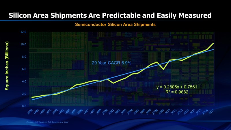
Figure 9. Area of silicon produced each year
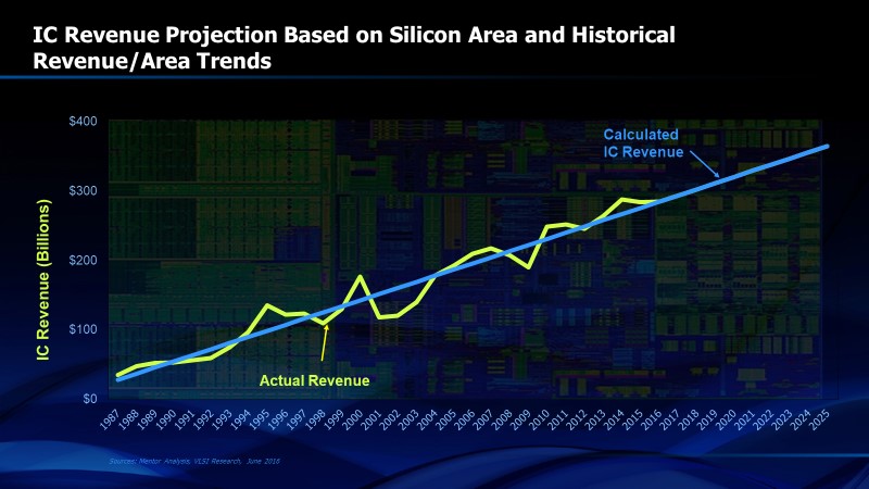
FIGURE 10. Integrated circuit revenue vs calculation from silicon area and the revenue per unit area ratio
Semiconductor units shipped per year is also predictable (Figure 11). This data from VLSI Technology covers the period since 1994. While modest deviations do occur in years of severe recession or accelerated recovery, the long term trend is apparent and predictable. If you are purchasing capital for the long term, especially for assembly and test equipment, this data is particularly useful. Unit volume served as a cornerstone of semiconductor forecasts at the time I joined the industry in 1972. As far as I know, the unit volume had grown every MONTH since the start of the industry and it continued to do so until December of 1974 when the oil shock caused implosion of the market and semiconductor volume fell precipitously.
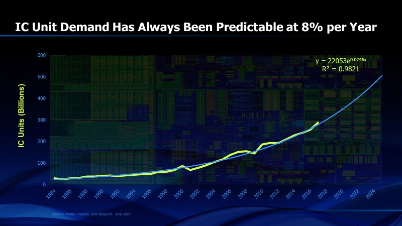
FIGURE 11. Integrated circuit annual unit volume of sales
One of the most common errors in semiconductor forecasting occurs when forecasters look only at revenue, ignoring the variability of price in the long term trend. The unit volume is stable and predictable but the price is not. At the Symposium on VLSI Technology in Hawaii in 1990, Gordon Moore and Jack Kilby were present and we all commiserated about the death of Bob Noyce (who was Chairman of SEMATECH at the time) the day before the conference started. Despite his grief, Gordon went ahead with his presentation the next day highlighting what might be referred to as Moore’s Second Law, although it never caught on (for good reason). Gordon graphed the average selling price (ASP) of semiconductor components over their lifetimes, especially memory components. His conclusion was that semiconductor components that start out at higher prices will eventually cost $1.00. Figure 13 shows the data since 1984. While the current trend and the distant history suggest that Gordon may have been right, this trend reveals major interruptions, the most notable of which was the DRAM shortage that occurred when Windows ’95 was introduced in 1995. That drove up ASP’s and we have been slowly trending down ever since then toward the $1.00 asymptote. The $1.00 price point should never be reached because there will always be newer components coming into the market but Gordon’s hypothesis is certainly interesting if not compelling.
One more interesting statistic is the number of transistors produced per engineer each year (Figure 13). This is a quasi-measure of design productivity that reflects both the growing number of transistors per chip as well as the increasing volume of chips that have been sold each year. By this measure, productivity has increased five orders of magnitude since 1985.
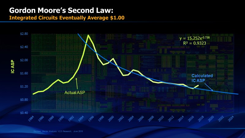
FIGURE 12. Average selling prices (ASP’s) of semiconductor components
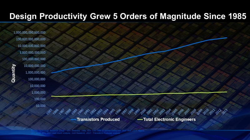
FIGURE 13. Transistors produced per electronic engineer
Share this post via:


Consolidation and Competition: Who is Winning the $4.5 Billion Interface IP Race?